
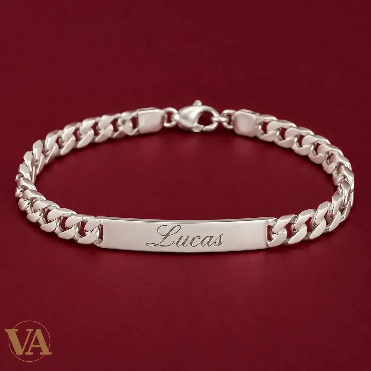
ID bracelet engraving: how to choose a readable font
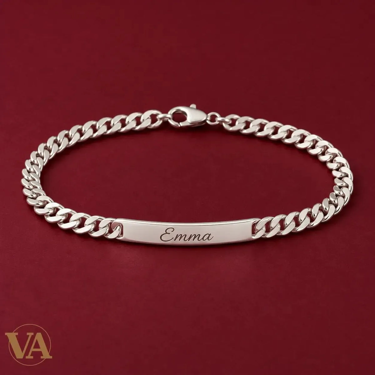
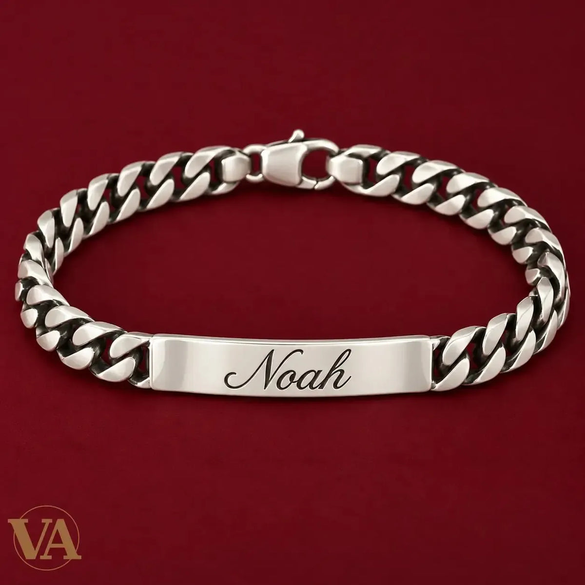
Names shown in the visuals are personalisation examples presented as simulations.
The same name can look tender, understated or bold depending on its lettering. On an ID bracelet, the choice also affects legibility: the letters must fit a plate only a few millimetres high. The right option combines the style you like with text that remains clear.
The engraveable sterling silver bracelet collection lets you select lettering for each side. Here is how to compare the options without relying solely on an enlarged screen preview.
Lettering options in the Vindicta module
| Lettering | A starting point | What to check |
|---|---|---|
| Monotype Corsiva | A name or flowing word | Joined letters and accents |
| Bradley Hand ITC | A personal, handwritten feel | Legibility of the whole message |
| Baskerville Old Face | Classic initials or a name | Fine details at jewellery scale |
| Calibri | A date or restrained inscription | Spaces and distinct numerals |
| Imprint MT Shadow | A decorative effect | Clear outlines on a small plate |
| Viking, Pirate of the Seaside, Vampire Wars, Pokmon Hollow, Waltograph | An expressive or playful choice | Every letter and numeral |
These are the selector names checked when preparing this guide; options may change. Classic lettering previews can depend on fonts available on your device. The display helps you choose a style but is not an exact measurement of the finished engraving. Ask for advice before confirming if a letter looks unclear.
Names, dates and initials need different checks
A name: recognise the whole word
For Emma or Noah, start with a style you like, then read the complete name. An attractive capital is not enough if the rest is hard to recognise. A hyphen in a double name takes space too: keep the intended spelling and try simpler lettering rather than removing an important part.
A date: make the numbers distinct
Compare the 1s, 7s and separators. The format 19.10.2026 uses ten characters; 19/10/26 uses eight. A shorter format leaves more room, but should remain understandable to the wearer. Plain lettering is a useful reference when comparing more decorative options.
Initials: consider spacing and punctuation
K + S, K.S. and KS have different lengths and rhythms. Decide how you want them arranged before choosing the font. A simple layout can be as distinctive as a decorative one, especially on a narrow plate.
Why character count is not the whole story
Two eight-character messages do not necessarily occupy the same width. M and W are wider than I or l in many fonts; curves, accents and spaces also affect the composition. The 14-character limit per side is an input rule, not a guarantee that every inscription will have the same letter size.
For a shorter message, browse our 40 ID bracelet engraving ideas with character counts. To compare plates, the 5 mm bracelet has a 30 × 5.20 mm plate, while the 8 mm bracelet has a 40 × 8.10 mm plate. Chain width and plate dimensions are separate measurements.
Centring and margins: what to look for
A balanced inscription leaves space around the lettering and follows the plate’s orientation. Filling the entire visible rectangle is not the aim: margins and rounded edges need room, and details should stay readable. Check each side separately; a name on the front and a date on the reverse may benefit from different fonts.
Look at the whole composition. A descending stroke, such as in g or y, can affect the impression of vertical centring. The preview helps identify an apparent problem. If text looks displaced, crowded or incorrectly displayed, have its layout confirmed before ordering.
A simple way to decide
- Enter the exact message, including accents.
- Compare a restrained style and a more expressive one.
- Review it at a scale close to the jewellery, without using your screen as a ruler.
- Check both sides in the order summary.
- Confirm the model, length and option prices.
Frequently asked questions
Which font suits a small plate?
Begin with short text and easily distinguished letters, then compare the preview on the chosen model. No single font is best for every name: letter shapes and the useful plate area work together.
Can the reverse use different lettering?
The module provides a font selector for each side. Select the front-and-reverse option and check that both choices are recorded correctly in the summary.
Continue with our personalised silver bracelet buying guide, or explore the bracelets available for engraving.
✦ Vindicta — Solid 925 silver
The piece that makes the difference
Certified 925 silver · Free shipping from €69 · 10 years of excellence
Natural Stone Jewellery →



Leave a comment
This site is protected by hCaptcha and the hCaptcha Privacy Policy and Terms of Service apply.